Here are some fictional companies/products that I would like to design a logo for !
1. The Sweetest Touch - This company will primarily be a line for skin care, specializing in lotions, creams, and body butters. Each product will be individually wrapped in a clear packaging with a ribbon tied around it corresponding with the colors on the label of the product. The colors on the label will be a replication of the different scents available (ex. purple ribbon for lavender bath soap). The word "Sweetest" in the company name stands for all the varieties of flavors/scents available within the company. For the logo I was thinking just a simple hand print outline that can be shrunken/expanded easily for packaging. The hand print is something that I feel can be remembered and also is a good replication of the word "touch" in the company. A colored ribbon around one of the fingers also would be a good idea to add to the logo to give it some color and also tie it into the package design.
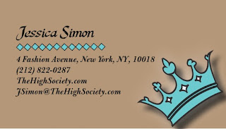
2. High Society - This company will be a jewelry company specializing in monograms (initial/name jewelry). From gold, silver, white gold, rose gold, etc., this company is all about specialization. From the plate that the monogram will be placed on, to the font of the monogram and down to the monogram's detail, almost everything is customizable. The company's name "High Society" is to correspond to the attitude of "getting it all" or "getting everything/anything you want" since the product relies solely on the buyer. The logo for this would be a crown with HS in the middle of it that will be engraved on the back of all the plates of jewelry.
3. Candied - This company is a cupcake company where each cupcake is topped off with something that is candied- candied fruit, candied bacon, candied mint, etc. It specializes in its unique cupcake selections and will pride itself on experimenting with making new cupcake flavors that have never been made before! "Candied" will deliver, where the delivery boxing will have its logo on top and a tough ribbon tying the package together. The logo itself will be the classic "sucker candy" looking design (the circle with the plastic pinched on each end) and the word Candied in script writing inside of it.
4. Fair-Haired - This will be a hair salon, hence the word "hair" in the name. The word "fair-haired," however, means to adored, admired, cared for, so this salon will put all their customers first to make sure they get those dearest looks that they want. Because it's a hair salon, I want the name to be in the logo so it can be recognized easily when it is displayed outside the stores. I think the logo will be exactly the name in a sort of script type, however, the "F" will be in the shape of a blowdryer and a different color than the rest of the name.
5. All Tied Up - This company will particularly be a womens'/girls' headband company that are handcrafted. With all different styles, from classic round ones, to hippie bands, to braided hair bands, to bow bands, to beaded bands with jewels, the selection is endless. The headbands will come in a colored pouch, that will vary in size depending on how many headbands purchased, with pull ties. The pouch will be very reusable! The logo will be the words "All Tied Up" literally all tied up and jumbled together giving the logo a stringy/lacy/tied look.
Logo Critques
1. Twitter- The blue bird is a very recognizable symbol for Twitter. On Twitter, you can post little status updates on almost anything you'd like, which are called "tweets." As an animal, birds tweet and chirp, so I think making the bird symbol for this social media website was a phenomenal idea. People can correlate the sound birds make to the "tweets" people send out, making it a memorable logo overall. It also can easily be shrunken/enlarged in different sizes as well.
2. Chanel- I personally think this designer name brand has a fantastic logo. The creator of the brand's name is Coco Chanel and that is where the two C's come intertwined. Because the brand covers a variety of merchandise from bags to clothing, the logo is easily placed on anything that it needs to be because of its simple freshness. The clean cut of the overall logo relates to classiness, which is what the brand prides itself on.
3. This logo is for a social media network in which people can communicate with each other via webcam. I personally do not like this logo and think it could have been designed with more creativity. It is very blunt which may make it more noticeable, but it lacks originality and inspiration. It is extremely plain and it is hard to tell exactly what the blue part of the logo is (a cloud?). However, I do like that this company chose a creative name for its program that is very original!

4. This red logo is for a snowboarding/skiing/skating/surfing brand name, Quicksilver. I think this logo works great based on what kind of merchandise the company sells. The logo itself has what appears to be a big wave over a mountain top and the company sells products that go along with either of those things. It was clever that they put the wave and the mountain top together, giving the logo a more complete look. I also like how they used red because it is a very dominant, often bright color that sticks out perhaps more than a different one in the color scheme.

5. Java is a computer programming language that allows a computer to be able to do many things, from video chatting with others, to watching videos, to streaming live on a website. I think this logo is great because it is kind of a play on words. Although java is usually recognized as being associated with coffees, the company Java itself actually has nothing to do with "cup of Joe's." It is humorous in the sense that it takes the word's most associated meaning, coffee, and actually uses that as its symbol to work with. People easily recognized Java now as more than just coffees and as a computer programmer. Like Quicksilver, it also incorporates the vibrant color of red to attract more focus onto the logo.


