Tuesday, October 30, 2012

The Eiffel Tower and I!


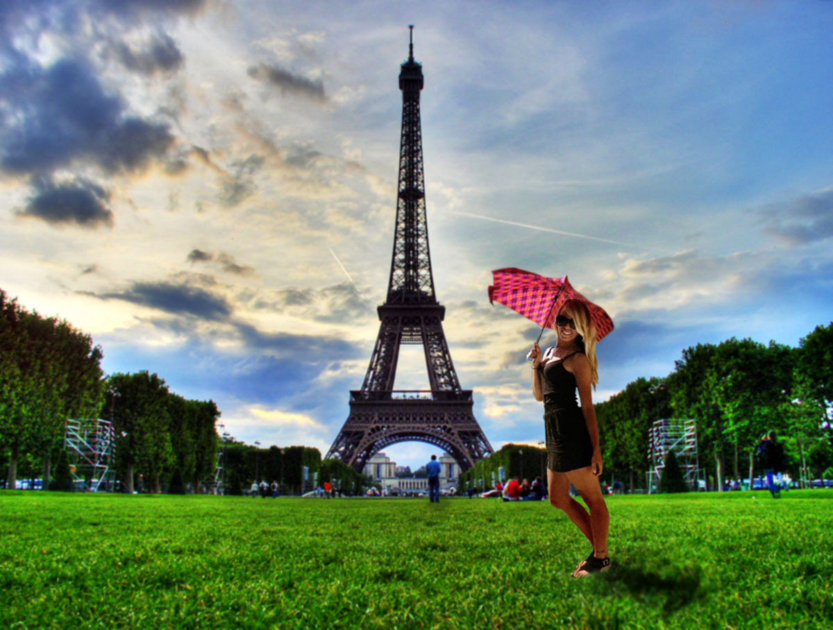
I decided to insert myself to a place that not only I've never been to, but also a place I would love to visit! This is me visiting the Eiffel Tower in France on a sunny day! It was a great experience and a beautiful afternoon!

On a serious note, I had a fun time doing this assignment. It kept me entertained and wanting to work more! Overall I felt comfortable with Photoshop, too.

Tuesday, October 23, 2012

"Surreal"


For my complex vector illustration I decided to use the movie poster for "Black Swan." I named this piece "Surreal" because the words meaning correlates with what the movie is about and also describes the type of artwork I used in my picture. Surreal means having a disoriented quality, or being hallucinatory like a dream. In the movie there are a lot of unrecognized hallucinations and unreal events, which I think is represented by the soft blurs of my piece. I tried to make it as if the "Black Swan" looked like she was disappear because in the movie she mentally gets lost and cannot find herself. Surreal can also mean   bizarre which is demonstrated by the dark red, bloodshot eyes I drew on the character. I love the passion for dance that the movie portrays and hope that my desire to exemplify the "fire" in her eyes shows that. 

Sunday, October 14, 2012

Exquisite Corpse

This is my exquisite corpse drawing. Very silly, I know, but it was a lot of fun creating it! The picture itself is based off my first pet I ever had, my cat Fluffy, and how she was always hungry all the time (hence the round belly). I decided to have fun with it and add the backyard looking background, too. This assignment not only let me use my creative side, but also let me enhance my skills in Illustrator. I used the "scallop" paintbrush tool to give the outline of the cat a "furry" look, a tool I never used before!
Meow!

Saturday, October 6, 2012

The High Society Final Logo


This is my final logo for my "The High Society" monogram jewelry company. I choose the color of tan/beige to represent the color of gold since it is a jewelry company. The light teal/mint color is supposed to represent the sophistication of the brand, as to me it was the least "cheesy" or "cheap" color I thought of. The crown and diamond used to replace the i's in the title demonstrate the company's "high class" kind of feel. The overall logo title is written in a font titled "Last King's Quest," also giving the logo a royal tone. Since you may not be able to tell what exactly the company is based on just the title alone, I decided to add in the blurb "Custom monogram jewelry." This part of the logo is written on what looks like a gold plate, which I originally described in my first logo ideas that I wanted this company to include. I also chose to give the first letters of each word a different color than the rest of the word so they can be used just as "THS" on certain pieces of jewelry that may be too small to include the entire logo. Also, the idea of monograms just includes initials, and the larger "THS" portrays a sort of monogram in itself.

Monday, October 1, 2012

Typography Assignment: "Blackbird"

For the typography assignment I decided to outline a bird with the lyrics from the Beatles song "Blackbird." I really love what birds symbolize (freedom, flight adventure) so I wanted to ultimately create something that was important to me. I also really like the lyrics to this song and think it fit extremely well with the overall bird image/ideal. I had a  great time working with illustrator to make this image!