Monday, December 10, 2012

Final Project Corporate Identity

My letterhead had a lot of changing around to it. Because my logo looks better on a white background, I found that there was a lot of negative space that I needed to work with for my logo. Because of this I felt as though I needed to add more, such as the beige border on the bottom and then the diamonds at the top. I incorporated the diamonds into the letterhead because it reflected the real diamonds that the company will sell! I included the website, address, and telephone number on the bottom of the letterhead, the three most important components of a company. 
This is the final business card for "The High Society." My creative process had a lot of alterations, and after finally picking some sort of creative letterhead, I thought I should make my overall components of my business more balanced. For example, I added the diamond border from the letterhead onto my business card, something it lacked when I first made it. I also made my business card be vertical on the front then horizontal on the back, something I feel is more unique than other business cards. Because of this, the crown on the front fit more evenly on the overall card, but I did have some problems with spacing on the front because of the negative space. By moving things around, however, I think I captured the negative space better in the end! I am overall very happy with the way the card came out.


My brochure was difficult to work with because I could not find a lot of images that had monograms since they are more of a "new" thing and becoming increasingly popular as the days go on. I thought it would be relevant to make my overall company something that is popular in today's society because it would take the interest of others and classmates more so. I took basic jewelry images off of stock photo websites and acted as if they were something that my company could make or incorporate monograms into. I also added either the crown logo or diamond logo onto almost every page of the brochure (minus a few) so the company would hopefully stick in the customers head.


Monday, November 19, 2012

Corporate Identity Questionaire


1)   What is your business?
My business is a custom jewelry company.

2)   Describe your business in one sentence
My jewelry company is completely customizable, specializing in giving the consumer everything and anything they desire.

3)   Who is your target audience?
The target audience is for females of all ages. Since the jewelry is all real, it can get pricy. The more customization that is added, the higher the price will be.

4)   Who are your competitors?
Any jewelry companies (Kay, Tiffany's,Cartier, etc.). Ones in particular that specialize with monograms.

5)   What makes them better/worse than your product/service?
What may make my product better than other jewelry companies is that it's all based on the consumer. Although there are set designs/products you can choose from, you can also design a customized piece of jewelry from scratch. Consumers can also do this online that gives them a preview of what exactly their finished product will look like.

6)   Do you currently have an identity?  (This is more for companies that are already established and you’re just revamping the logo/corporate identity.  If you have a new company or product, skip this question.
      Not currently established.

7)   (If your answer to #6 is no, skip this question)  What do you like about it and what don’t you like about it?

These following questions might seem silly, but their purpose is to help generate ideas.
1)   How do you want your image to be seen in two years?
In two years I want the company's image to be seen as an elite jewelry company that gives off a taste and vibe of higher class products that last a lifetime. I want this company to sky rocket in those who want to be able to represent themselves and their desires through this jewelry.

2)   If your company was an animal, what animal would it be and why?
My company would be a white lion. This animal is recorded as one of the most expensive animals around the world according to the English News and is also rare, reflects purity/radiance, and beautiful to look at.

3)   If your company/brand was a person, who would it be and why?
My product would be Audrey Hepburn, a film and fashion icon who displayed and reflected elegance and class.

4)   If your company/brand was an object, what would it be?
A crown, making anyone who has it placed upon their heads feel worthy and like a King or Queen. We want the customers of The High Society to feel extremely special when wearing our products.

5)   If your customer was a cartoon character, who would it be?
I had a hard time relating my product to a cartoon character so I had to look up some ideas. I first thought of Hello Kitty, particularly because this character relates to mostly females only and something that this gender is extremely familiar with. Also, I thought of Smurfette, the blonde smurf that is extremely sociable, always dressed to impress in her white heels, and makes heads turn.

Tuesday, November 13, 2012

Lyrical Collage- Nicotine


For my lyrical collage I decided to do the song "Nicotine" by Anet, which is featured in the popular movie called "Thirteen." The song is analyzed to be about breaking away from social norms, usual trends and corrupt societies to just let go and be able to be oneself. Many of the lyrics hint escaping world, such as "we're all numbers in the numbers game" and "show me a day where nobody is killed." The reason I choose this song is because of its unique song lyrics that I knew I'd be able to represent in various ways through images and manipulated photographs. The specific lyrics I chose were "O I love to touch your mind when I sit in your car, Coca Cola baby's signing autographs on mars."

For my image I thought I'd show a couple escaping somewhere, which was represented by the couple in the car flying off into space and to Mars. The couple's heads are closely touching, representing the "touching the mind." Behind the couple in red I made a custom brush of a neuron that is found in the brain when the mind is activated and gave it a custom texture throughout. I also have the footprint of a baby on Mars, which is a direct representation of "signing autographs on Mars" as well as old fashioned coke bottles flying throughout space. I thought of the concept of zero gravity so I made the coke bottles scattered, looking like they may be floating. The coke bottles were also created by a custom paint brush image.

Below are all the images incorporated into my collage:


Monday, November 5, 2012

Custom Graphic: Sunset

This is my custom graphic of a sunset on a beach. I used three types of new brushes, which are shown defaulted below! I used my own skills to free hand and add in the sun in the background, the clouds, shadows and the flares of the sun. The sand, ocean water and the palm trees were primarily from the new brushes I defined, with altered colors and blurs added in. For the palm tree bush I had to edit out the copy right over it to make sure my overall brush did not have that included in it, using the paint brush tool. I used the content aware move tool for most of the sand parts so they did not look blocky and have sharp edges, as it was a small image originally. 
Credit: http://jacarandatree.blogspot.com/2010_05_01_archive.html

Credit: http://www.layoutsparks.com/pictures/sand-0

Credit: http://www.antechserv.com/id1.html


Tuesday, October 30, 2012

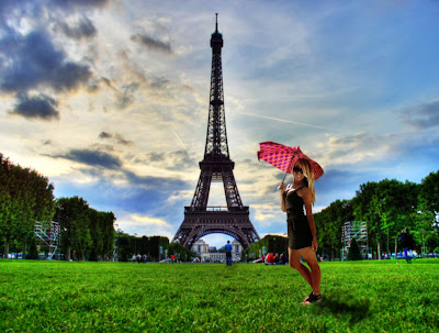
The Eiffel Tower and I!


I decided to insert myself to a place that not only I've never been to, but also a place I would love to visit! This is me visiting the Eiffel Tower in France on a sunny day! It was a great experience and a beautiful afternoon!

On a serious note, I had a fun time doing this assignment. It kept me entertained and wanting to work more! Overall I felt comfortable with Photoshop, too.

Tuesday, October 23, 2012

"Surreal"


For my complex vector illustration I decided to use the movie poster for "Black Swan." I named this piece "Surreal" because the words meaning correlates with what the movie is about and also describes the type of artwork I used in my picture. Surreal means having a disoriented quality, or being hallucinatory like a dream. In the movie there are a lot of unrecognized hallucinations and unreal events, which I think is represented by the soft blurs of my piece. I tried to make it as if the "Black Swan" looked like she was disappear because in the movie she mentally gets lost and cannot find herself. Surreal can also mean   bizarre which is demonstrated by the dark red, bloodshot eyes I drew on the character. I love the passion for dance that the movie portrays and hope that my desire to exemplify the "fire" in her eyes shows that.